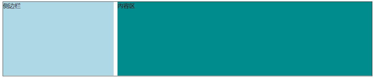
两栏布局
两栏布局就是:一栏定宽,一栏自适应。
BFC
将定宽的那一栏浮动,另一栏触发 BFC,实现两栏。
两栏之间的空隙通过给浮动的那一栏设置 margin 实现。
1
2
3
4
5
6
7
8
9
10
11
12
13
14
15
16
17
18
19
20
21
22
23
24
25
26
27
28
29
30
31
32
33
| <style>
.clearfix::after {
content: '';
display: block;
clear: both;
}
.wrapper {
border: 1px solid;
}
.aside {
float: left;
width: 300px;
background-color: lightblue;
margin-right: 10px;
height: 200px;
}
.main {
overflow: hidden;
background-color: #008c8c;
height: 200px;
}
</style>
<div class="wrapper clearfix">
<div class="aside">
侧边栏
</div>
<div class="main">
内容区
</div>
</div>
|
参考圣杯布局
如果需要让内容区先渲染,则 BFC 不太好使,可以参考三栏布局方案圣杯布局。
CSS是关键,利用圣杯布局的思想(浮动 + margin + position) 实现:
1
2
3
4
5
6
7
8
9
10
11
12
13
14
15
16
17
18
19
20
21
22
| .wrapper {
padding-left: 300px;
}
.aside {
float: left;
width: 300px;
background-color: lightblue;
margin-right: 10px;
height: 200px;
margin-left: -100%;
position: relative;
left: -300px;
}
.main {
width: 100%;
float: left;
overflow: hidden;
background-color: #008c8c;
height: 200px;
}
|
参考双飞翼
和双飞翼的HTML一样,给内容区加了一层:
1
2
3
4
5
6
7
8
9
10
| <div class="wrapper clearfix">
<div class="main">
<div class="content">
内容区
</div>
</div>
<div class="aside">
侧边栏
</div>
</div>
|
CSS:
1
2
3
4
5
6
7
8
9
10
11
12
13
14
15
16
17
18
19
20
| .aside {
float: left;
width: 300px;
background-color: lightblue;
margin-right: 10px;
height: 200px;
margin-left: -100%;
}
.main {
width: 100%;
float: left;
overflow: hidden;
background-color: #008c8c;
height: 200px;
}
.main .content {
margin-left: 300px;
}
|
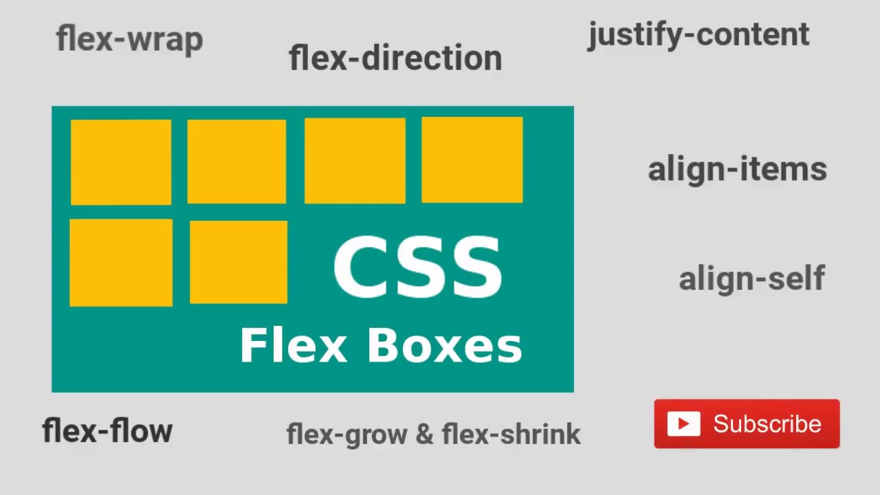
flex
1
2
3
4
5
6
7
8
9
10
11
12
13
14
15
16
17
18
19
| .wrapper {
border: 1px solid;
display: flex;
}
.aside {
order: -1;
width: 300px;
flex: 0 0 auto;
background-color: lightblue;
margin-right: 10px;
height: 200px;
}
.main {
flex: 1 1 auto;
background-color: #008c8c;
height: 200px;
}
|
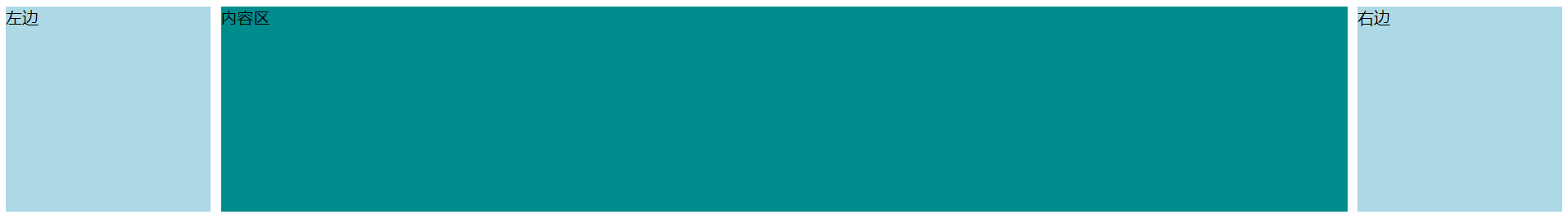
三栏布局
三栏布局就是:左右模块固定宽度,中间模块随浏览器变化自适应。
BFC
利用浮动 + BFC 来实现,但是需要将左右两栏放在中间内容之前。
1
2
3
4
5
| <div class="content clearfix">
<div class="left"> 左边 </div>
<div class="right"> 右边 </div>
<div class="center"> 内容区 </div>
</div>
|
实现方式:
1
2
3
4
5
6
7
8
9
10
11
12
13
14
15
16
17
18
19
| .left {
float: left;
width: 200px;
height: 200px;
background-color: lightblue;
}
.right {
float: right;
width: 200px;
height: 200px;
background-color: lightblue;
}
.center {
height: 200px;
background-color: #008c8c;
overflow: hidden;
}
|
圣杯布局
因为内容区的内容更加重要,需要优先加载,如果中间内容过多,加载就会消耗比较长的时间。
圣杯布局的思路是:让三栏都浮动,然后通过 margin 让左右两栏分别移动到内容区的左右,并通过父元素给左右两栏留出空间,左右两栏通过 position 移动到空位中。内容区 width: 100% 跟随父元素的宽度实现自适应。
1
2
3
4
5
| <div class="content clearfix">
<div class="center"> 内容区 </div>
<div class="left"> 左边 </div>
<div class="right"> 右边 </div>
</div>
|
CSS处理:
1
2
3
4
5
6
7
8
9
10
11
12
13
14
15
16
17
18
19
20
21
22
23
24
25
26
27
28
29
30
| .content {
padding: 0 200px;
}
.left {
float: left;
width: 200px;
margin-left: -100%;
height: 200px;
background-color: lightblue;
position: relative;
left: -200px;
}
.right {
float: right;
width: 200px;
height: 200px;
background-color: lightblue;
margin-left: -200px;
position: relative;
right: -200px;
}
.center {
width: 100%;
float: left;
height: 200px;
background-color: #008c8c;
}
|
双飞翼
和圣杯布局类似,都是将三栏都浮动然后通过 margin 来使得三栏在同一行,不同的是内容区又包了一层,不再需要父元素的帮忙和定位,只要给真正的内容区设置 margin 避免被左右两栏遮挡就行。
HTML 结构改变:
1
2
3
4
5
6
7
8
9
| <div class="content clearfix">
<div class="center">
<div class="inner">
内容区
</div>
</div>
<div class="left"> 左边 </div>
<div class="right"> 右边 </div>
</div>
|
CSS处理:
1
2
3
4
5
6
7
8
9
10
11
12
13
14
15
16
17
18
19
20
21
22
23
24
25
26
27
| .left {
float: left;
width: 200px;
margin-left: -100%;
height: 200px;
background-color: lightblue;
}
.right {
float: right;
width: 200px;
height: 200px;
background-color: lightblue;
margin-left: -200px;
}
.center {
width: 100%;
float: left;
height: 200px;
}
.inner {
margin: 0 200px;
background-color: #008c8c;
height: 100%;
}
|
flex
1
2
3
4
5
6
7
8
9
10
11
12
13
14
15
16
17
18
19
20
21
22
23
24
25
26
| .content {
display: flex;
}
.center {
flex: 1 1 auto;
height: 200px;
background-color: #008c8c;
}
.left,
.right {
width: 300px;
flex: 0 0 auto;
height: 200px;
background-color: lightblue;
}
.left {
order: -1;
margin-right: 10px;
}
.right {
margin-left: 10px;
}
|
CSS实现居中
默认样式:
1
2
3
4
5
6
7
8
9
10
11
12
13
14
15
16
| <div class="box">
<div class="content"></div>
</div>
<style>
.box {
width: 200px;
height: 200px;
background-color: lightblue;
}
.content {
width: 100px;
height: 100px;
background-color: #008c8c;
}
</style>
|

水平居中
绝对定位 + margin
1
2
3
4
5
6
7
8
9
| .box {
position: relative;
}
.content {
position: absolute;
left: 50%;
margin-left: -50px;
}
|
绝对定位 + transform
1
2
3
| .content {
transform: translateX(-50%);
}
|
定宽 + margin: auto
1
2
3
| .content {
margin: auto;
}
|
将块盒变为行块盒
1
2
3
4
5
6
7
| .box {
text-align: center;
}
.content {
display: inline-block;
}
|
flex 布局
1
2
3
4
| .box {
display: flex;
justify-content: center;
}
|
垂直居中
绝对定位 + margin
绝对定位 + transform
flex 布局
1
2
3
4
| .box {
display: flex;
align-items: center;
}
|
vertical-align + line-height
1
2
3
4
5
6
7
8
| .box {
line-height: 200px;
}
.content {
display: inline-block;
vertical-align: middle;
}
|
水平垂直居中
绝对定位 + margin
1
2
3
4
5
6
7
8
9
10
11
| .box {
position: relative;
}
.content {
position: absolute;
left: 50%;
top: 50%;
margin-top: -50px;
margin-left: -50px;
}
|
绝对定位 + margin: auto
1
2
3
4
5
6
7
8
9
10
11
12
| .box {
position: relative;
}
.content {
position: absolute;
left: 0;
top: 0;
right: 0;
bottom: 0;
margin: auto;
}
|
绝对定位 + transform
1
2
3
4
5
6
7
8
9
10
| .box {
position: relative;
}
.content {
position: absolute;
left: 50%;
top: 50%;
transform: translate(-50, -50%);
}
|
flex 布局
1
2
3
4
5
| .box {
display: flex;
align-items: center;
justify-content: center;
}
|